Megan R.
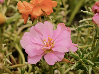
This photo was taken a few weeks ago in my backyard. I used a lot of zoom to make the flower look much larger than it actually is. I like this photo because it is very clear and focused. To edit this photo, I used the antique option on iphoto.

3 comments:
I really like the depth of field in this picture. It makes the flower the main focus. I usually like when things are off center in a picture, but I think that the flower being in the center works for this picture. Also, the color really works for this image. I like that you used the antique tool. It makes the picture interesting because it's not the normal green and pink. Because it's antique, it makes me think of memories of summer. Overall, I really like it!
This is an awesome picture! I love how the flower is the main focus of the picture. It's a little off centered which makes the angle look unique and really focus on the subject, the flower. I also love how the colors are faded and not just your average colors. It adds a very warm effect to the photo. The last thing I absolutely love about this photo is how the flower seems to contrast against the green grass. The flowers in the background create interest in the photo as well!!!
I love this picture! I really like how the main subject, the flower, is in a very sharp focus. I also like how the subject is off-center which really works for this image. I liked that you used the antique option, it makes the mood of the seem peaceful. I think the texture of the grass and the flower make a really good contrast. I also love how you have more than one flower in the image.
Post a Comment