Thursday, September 23, 2010

"Photography"


Molly R.

I took this picture in my bathroom with a mirror that was hanging on my wall. I like this picture because it looks old. It also says a lot about me because i love taking pictures. I put the picture in black and white and put the boost color effect on it as well.

"Summer Evening"

Connor B.
i took this photo on the 12th of september at about 5 o clock pm. it was taken in my girlfriends backyard. I used a tripod and a timer to capture this. The only editing i used in this image was the retouch tool to change my skin.  The reason i like this photo is because i managed to get perfect light and yet a lot of color. also i like the way it is so focused on the subject.

"Antique Table"

Christopher J.

This photograph was take about a month ago in the sunroom of my house. This is my favorite photo because of the detail in the image, and how the background is just a blur. In iPhoto i cropped the image, i straightened the image and i also made it sepia. The edges in the image were also blurred.

"45 Toss"

Julianne F.
This picture was taken in my back yard. It is one of my favorites because I love the position of the subject's body and the motion of the flag in the air. It is at an angle where the viewer can see the pole and the silk. I also like how the background is at a slight angle. I cropped the image in iPhoto and then I used Photoshop to change the background to black and white and emphasize the pink color of the flag.

"Butterfly"

Anna W.
I took this photo in Tuscaloosa at the Alabama game.  This is my favorite photo because, it was really hard to get a still picture of a butterfly, and i think the contrast of the butterfly and the dull background looks really good. I used color boost and saturation in this photo.

"Moving On"

Molly P.
This picture was taken on the last weekend of August down in Auburn, Al. I chose this photo as my favorite because I absolutely love how Pearson, the subject, is in focus and the negative space is kind of blurry. I also really like how the colors pop out. To edit this picture, first I cropped and straightened it. Then, I intensified the definition of the photo.Under the effects tab on iPhoto, I chose to boost the color, which brought out the color of Pearson's eyes. Other than that, I just messed around with the saturation levels and exposure.

"Wave"

Robert S.
This photograph was taken at Destin, FL. This is my favorite image because I like that i caught the wave in mid-crash. I also like the beach a lot. To enhance this image, I pressed the enhance button and then I put the definition and sharpness all the way up.

"Cross"

Mallory A.
This photo was taken in my car. I like this photo because i really like how the colors of the beads are bright and very sharp and the background is slightly blurry. To edit this photo i adjusted the saturation, boosted the color, and used the vignette effect.

"Brown-eyed Looney"

Mary H.
This photograph was taken at the kids I babysit's house. This picture is my favorite because it is very clear and it also shows the personality of the boy. The only edit I made to the picture was boosting the color two times. 

"Oreo"

Tyler D.
The photograph was taken at my family's friend's barn.  The picture is my favorite because the colors contrast well together.  The black and white gives it a mysterious feel. The effects that I used to edit it were black and white, I boosted color, gave it an edge blur, and changed the saturation and temperature of the image.

"Hit"

Taylor C.
I took this photo during a lacrosse game at the hoover central fields, and i really like it because it captures a moment of the game, and shows great emotion and intensity in the game. I used enhance, cropping, and color adjustments to edit this photo in iPhoto.

"Simplicity"

Stefanie S.
This is a picture of one of my best friends Kimberly T. I took it over the summer in downtown Birmingham. This picture was a candid shot and it wasn't until I got home that I realized how much I loved this picture. I think it captures her personality perfectly. I changed the image to black and white and played with the contrast but overall I didn't really do any major editing to this photo.

"Jenny"

           Brittany M.
My photo is a picture of my cat, Jenny. This was taken in my backyard one afternoon in August. It is one of my favorite pictures in my About Me album. I really like this photo because of the angle it was taken and the focus on her face and in her eyes. I also like how the color of her eyes stand out. I enhanced this photo by boosting the color a couple of times and retouching her face because there was dirt on her nose and I didn't want that in the photo.

"Tae Kwon Do"

Luis E.
This photo was taken in my backyard when I was training with my friends. I like this photo because even though I'm in motion it still came out pretty good. I used retouch and enhance to edith it.

"Summer Color"

Megan R.
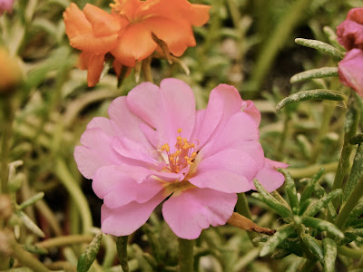
This photo was taken a few weeks ago in my backyard. I used a lot of zoom to make the flower look much larger than it actually is. I like this photo because it is very clear and focused. To edit this photo, I used the antique option on iphoto.

"Energy"

Britney B.

I took this picture when I was puling up to a stoplight (yes I was driving!). I love it because the background is dark and solid and it has light colored lights racing across the picture in contrast to it, which I think looks great. I edited this in Photoshop by adding curves to get the lights to contrast so well and get the brightness where I wanted it.  

"Concert"

Joanna W.
This photo was taken at a Hardcore concert. It shows my friend Sam playing his keyboard during one of the songs. It is my favorite because of the focus on his hand    and the keys. I edited it by cropping it, adding a blurred edges effect, increasing the saturation, and increasing the exposure. 

Wednesday, September 22, 2010

"America's Pastime"


Connor H.
This Photo was taken at the Braves v. Marlins game. This pictures antique look os to symbolize that baseball is America's past time. I added a vignette,  and added an antique look. While i also straightened the picture.